What’s that old saying? “Imitation is the greatest form of flattery?” Well, there is something to be said about that, certainly, but sometimes imitation can be happenstance as well.
We draw inspiration from many avenues in life and that is no different when it comes to the creation of famous uniforms.
As one of the more historic names in the famed Big Ten conference, the Iowa Hawkeyes have one of the more recognizable looks around. This is partially due to the fact that Iowa has been playing football for well over a century.
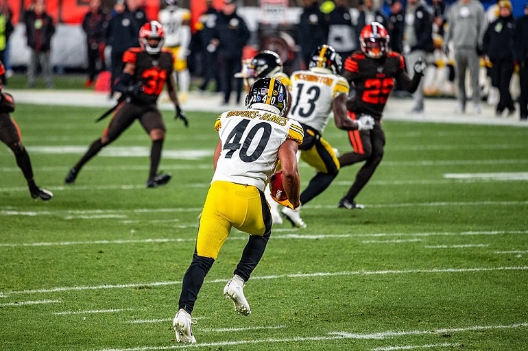
There is also the undeniable fact that their uniforms look a lot like those of the Pittsburgh Steelers. The Steel City’s franchise has long been representing the hardworking city with simple but intimidating black and gold. Here’s how Iowa’s uniforms came to look much the same and it may not be as coincidental as you may think.
How the Current Uniforms Came to Be
The Hawkeyes uniforms that we know today were created back in 1979 by then-head coach Hayden Fry. What Fry was trying to achieve was very simple: he wanted to mimic another dominant franchise as he hoped to bring the Hawkeyes to national prominence.
So, what did he do? He mirrored the Pittsburgh Steelers, the most dominant NFL franchise of the 1970s. Keep in mind, he didn’t just pilfer the look. He reached out to the team asking for permission, even receiving a jersey and pair of pants from Terry Bradshaw so that they could get the lettering, numbering, and trim down right.
Fry also commissioned a new logo, leading to the creation of the Tigerhawk by local marketing artist Bill Colbert. What was born was Iowa’s Steelers-inspired uniforms that have remained the look ever since.
Great day to be a Hawkeye! Taking the Heroes Trophy back to Iowa City. Thank you Iowa fans! pic.twitter.com/KRDh2MUOhY
— Phil Parker (@CoachParkerIowa) November 25, 2017
Before the 1970s
Prior to the 1960s and 1970s, you would be hard-pressed to find standout designs in the sports world. It’s part of the reason why the winged helmet of the Michigan Wolverines became famous, to begin with; standing apart in that day and age really meant something.
Before the change implemented by Fry, the Iowa uniforms were quite simple. Through the early days of the program –the 1890s through the 1930s – the look was a simple black jersey with yellow/gold numbering. Helmets were also a lot simpler then, not allowing much room for designs or numbers.
If anything, there are two uniforms that stood out from the pre-1970s period. The first is the 1920s team that wore gold helmets and gold wings across the chest. At the time, it was like nothing else out there and has since been paid tribute to by recent Hawkeye teams.
The second is the “golden age” look, the last time that Iowa had yellow helmets. Clean and simple uniforms with gothic jersey numbers, were noteworthy for the “Green Bay gold” appearance of the helmets.
A Historic Look
There are many who look to the Hawkeyes’ clean, Steeler-Esque uniforms as a show of consistent quality. The Hawkeyes have largely sported the same look since that 1979 campaign, though they have worn a few throwbacks and other variations in the meantime (more on those later).
Much like the Steeler logo is as recognizable as they come, the Tigerhawk logo is one of the defining logos for the Big Ten Conference. It sets the tone for the rest of the uniform, one that speaks of power and tradition.
There is something to be said about consistency as well. Take a more modern example like the Oregon Ducks. For a few years, the Ducks were the talk of college football for their various bright and fanciful uniform designs.
Yes, those looks helped to separate Oregon and also make a positive impact on recruiting. But historically, how many of those uniforms are going to be remembered? Iowa’s will be the kind that is to be remembered for decades because it doesn’t fix what isn’t broken.
A Time for Change?
On the other side of the coin, there are those who feel like “tradition” is another word for “outdated.” Though no one wants to change the logo – it is one of the best in the conference, after all – there are others who feel like it might be time to update the uniforms.
We have seen a few retros and throwbacks that look great with the Iowa colors. That said, would a more modern look have the same impact in gold and black? That remains to be seen, though traditionalists are sure to fight to make sure that the current uniforms don’t go anywhere anytime soon.
The Most Notable Iterations of the Iowa “Steelers” Look
Despite holding strong with their Steelers-inspired uniforms, there have been a few standout changes since that 1979 season.
Sure, they have largely been one-off iterations, though there was a time in the 1990s when they would try something different. Let’s take a look at the most noteworthy variations of the Iowa “Steeler” look.
The 1990s Wings
Whether Iowa heard critics or was just looking to shake things up during the 1990s is uncertain. What is certain is that Iowa attempted to not only do something different but to go back to its roots as well.
For both the 1994 and 1995 seasons, Iowa’s uniforms would look noticeably different.
The Tigerhawk logo stayed put but everything from the neck down would change for the Hawkeyes. It began with the jersey, which featured the famed wings that had once been part of the “Roaring 20s” look from decades earlier. Just above the number, “Hawkeyes” would be spelled out with the Tigerhawk logo over the left breast.
The pants would see a widened stripe down the leg, still in the traditional gold of the program. It was a standout look to be sure, but not one that would leave a lasting impact. After just two seasons, the Iowa faithful – and the program alike – decided that going back to the traditional look would be the best option for the future.
Blackout Uniforms
During the mid-to-late 2010s, blackout uniforms became all the craze. Major programs across the country all began sporting them with some of the most famous being worn in places like Oregon and Ohio State.
Iowa would roll out the all-black look in a pair of major games. The first would be a 2015 game against Minnesota, propelling Iowa to a wild 40-35 win and giving them their first 10-0 start in the history of the program. The second would be an unexpected whooping of highly ranked Ohio State, drubbing the favorites from Columbus 55-24.
These uniforms would feature oversized gold numbers on a simple black jersey, “Iowa” adorned just above. The Tigerhawk remains but is oversized and black on black with a yellow outline, creating a sleek look. They even shout out the Steelers’ inspiration by having the Tigerhawk logo on one side of the helmet instead of both sides.
There is nothing like a blackout to intimidate the opposing team and you would be hard-pressed to top Iowa’s blackout. Don’t be surprised if Iowa breaks out the black-on-black look again in the near future.
2019 Gold Alternates
If you could only pick one variation from over the years, the 2019 gold alternates may be the resounding winner. This look was meant to be an homage to the “banana peel” look that the program once sported decades prior.
Despite the comedic name, these were anything but laughable. Bright yellow made the pants and uniforms stand out from a mile away. They also harken back to their past with the black wings across the shoulders, though in a much more subtle way than the 90s wings look managed.
Though we have not seen them since they could make for a fun homecoming game in the future. It also didn’t hurt the memorability factor considering they had a live hawk there for the photoshoot.
Did we just become best friends?! #Hawkeyes pic.twitter.com/GP3XyyRaqI
— The Iowa Hawkeyes (@TheIowaHawkeyes) June 28, 2019
“Evy Era” 1958 Throwbacks
If you thought that the Iowa uniforms have always had a shared look with the Steelers, it goes back well before that 1979 season. Sure, they made important changes that closed the gap even further, but the 1958 look (one of the best ever) wasn’t exactly light-years different.
The throwback to the Evy Era, which was capped off by winning the Big Ten, the Rose Bowl, and finishing the 1958 season ranked No. 1, is iconic for Iowa faithful. The helmet features the “Green Bay Gold” with a simple black stripe down the middle, black numbers on each side, and a grey facemask.
The uniforms are where the Steeler comparison can really begin. Simple black uniforms featuring a large block gold number and gold striping on the sleeves, it is hard to think of anything but “Steel Curtain” when looking at them.
The gold pants and narrow black stripe down the leg complete the look well before Fry had his epiphany. If anything, it goes to show how a few relatively simple changes can make uniforms look different.
Check out the sweet new uniforms @HawkeyeFootball will wear for Saturday’s blackout game against Ohio State. pic.twitter.com/bRA6e308zn
— The Iowa Hawkeyes (@TheIowaHawkeyes) October 30, 2017
Credits on Featured Image: Erik Drost, CC BY 2.0, via Wikimedia Commons
