The history of Iowa Hawkeyes football is a rich one. Founded in 1889, they have been part of the Big Ten conference going back to 1899. Over those nearly 130 years, they have worn more than a few uniforms over that time.
Determining the best of the best in Iowa football threads takes a lot of digging. After all, with so many variations, there are only so many that can stand the test of time.
Here are the most noteworthy uniforms that the Iowa football team has worn in its history.
🏈 NCAA Football Betting Promos (October 2025)
| Sportsbook | Offer | How to Claim? |
| Caesars Sportsbook | 💰 Bet $1, Get Double Winnings on Your Next 10 Bets | Claim here |
| Fanatics Sportsbook | 🔁 Bet & Get Up to $1,000 in No-Sweat Bets | Claim here |
| bet365 Sportsbook | 🎁 Bet $5, Receive $150 in Bonus Bets — Win or Lose | Claim here |
| DraftKings Sportsbook | 🚀 Bet $5, Instantly Unlock $200 in Bonus Bets | Claim here |
| BetMGM Sportsbook | 🏆 First Bet Offer: Bet $10, Win $150 | Claim here |
| FanDuel Sportsbook | ✅ Bet $5, Get $300 in Bonus Bets If Your Bet Wins | Claim here |
The Anatomy of the Hawkeye Uniform
Throughout its history, Iowa football uniforms have been relatively straightforward. After all, there is only so much that can be done with yellow and black as the primary colors. Moreover, Iowa City is a simple place and the uniforms need to match the locale.
Though they don’t get the attention that some of the flashier programs get – think Oregon, Miami, and the like – there is a lot to like about their uniforms.
They have also had some distinctly unique looks that stand out even with a simple basis behind them.
Respecting the past.
Representing the future.A look inside the design process | #Hawkeyes pic.twitter.com/ztk2EaJTk6
— Hawkeye Football (@HawkeyeFootball) June 27, 2019
6.) 1939 Ironmen Uniforms
There is nothing wrong with a classic and that is precisely what the 1939 Ironmen uniforms offer. Of course, it comes from the early days of football when uniforms were far more simplistic, with simple colors or patterns without logos.
It also comes from a time when Nile Kinnick, for whom the stadium is named and who is arguably the greatest Hawkeye ever, was roaming the field. The simple black jersey, the gold pants, and the iron-colored helmet made them look like they were men of steel.
Though they may not win any awards in this day and age, there is something to be said of a simple classic. For historians of the Iowa football program, one would simply be remiss if they left out the Ironmen look.
5.) 1977 Iowa Script Helmets
The Iowa uniform hasn’t seen a ton of change throughout the decades. The black uniform is largely the same, with different striping or differently colored numbers here and there. The script of the numbers has changed as well.
For this look, the jersey and pants remain as simple as ever. Nothing adorning the shoulders, a modest white-yellow-white striping on the sleeves. The pants are yellow with a thick black stripe down the side and a block number is featured on the front and back in white.
What sets the 1977 uniforms apart is the helmet. Iowa has worn its helmets – modern helmets, anyway – in one of two colors: black or yellow. The yellow always manages to pop and that is part of what makes this helmet so special.
But it is also due to what is on the helmet. There is no Iowa Hawkeye logo on the side, merely a stylish script “Iowa”. Script logos are not as popular as they once were, but they gave the Hawkeyes a much different look than they had been historically known for.
This is such a popular look that fans have been clamoring for it to be brought back as a throwback. With a modern touch, this could wind up not only being one of the best-looking uniforms in the Big Ten but the nation as a whole.
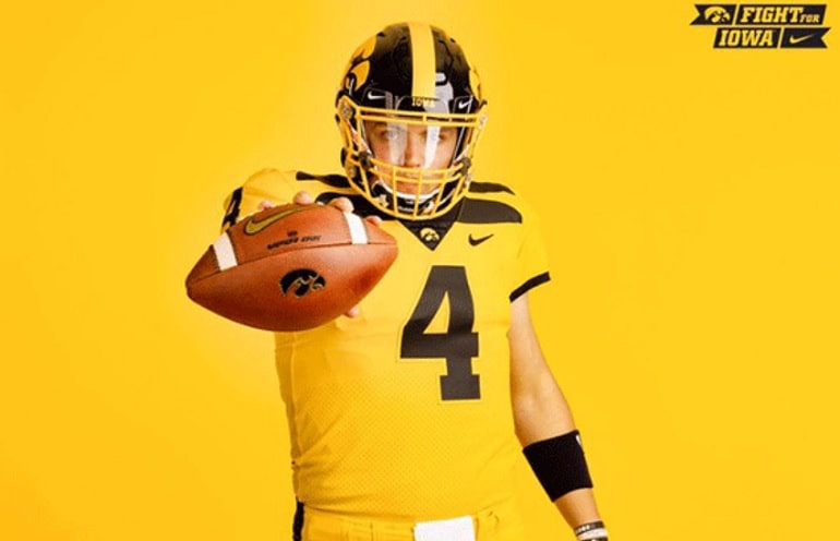
4.) 2019 Gold Alternate Uniforms
There are some who are not particularly fond of these 2019 retro alternate uniforms. There is no doubt that it left a lasting impression. Seeing as they were an homage to the “banana peel” uniforms the team had worn in years past, there is also history steeped in those uniforms.
First and foremost, yellow definitely stands out. The bulk of the jersey as well as the pants and socks feature the bright yellow of Hawkeye football. The jersey is also somewhat simplistic, with all-black numbers and black wings that adorn the shoulders.
Perhaps the most notable thing about these uniforms was the photo shoot itself. During the shoot, one of the players was captured holding a hawk. Combined with the yellow and black of the uniform, it definitely left a mark.
There are plenty of uniforms out there done in black and yellow, especially in Hawkeye history. But these all-yellow numbers manage to stand out. That is something separating it from the rest of the uniforms the Hawkeyes have worn.
3.) The 1990s Wings
Iowa football tried to step into modern times with both feet for two seasons in 1994 and 1995. The Hawkeye helmet remained as it is today, but the rest of the uniform saw substantial changes.
The home black and road white saw a change to the font of the lettering, outlined in yellow. The pants saw a yellow line part the middle of the traditional black stripe that had been on the pants for decades. But there was one addition in particular that stood out most: the wings.
We see them in the 2019 gold alternates, but the Hawkeyes tried them as a regular option for those two seasons. The golden wings, three on each shoulder, added a modern touch that the Hawkeye uniform had never seen before.
Though they were not quite as audacious as the 2019 “banana peels”, they are of important significance. Some franchises and programs with a lot of history attempt to modernize their looks. For some, it is successful. For others, it simply shows that what has worked for so long continues to do so.
It was a nice attempt by the Hawkeyes to modernize their look. But it was quickly realized that there is nothing wrong with the modern classic, created back in 1979 and is still worn to this day.
2.) 2010 “Evy Era” 1958 Throwback Uniforms
Nostalgia is en vogue these days and with good reason. There is nothing like remembering the good ole days and Iowa has a rich history to harken back on. With that rich history comes more than a few uniforms that look good with a retro update.
That is precisely what fans got when Iowa wore these “Evy Era” flashbacks during 2010. There are a lot of reasons to harken back to these uniforms, given that they saw the rise to power for Iowa football. In the 1958 season, they not only made the Rose Bowl but won the Big Ten Championship and even finished the season as the top-ranked program in the nation.
The uniforms themselves are quite simple but really hit the right marks. The helmet is yellow, featuring a simple black stripe down the middle, a black number worn on the side, and a grey facemask. The jersey is all black, with simple yellow striping on the sleeves and a full yellow number on the front and back. To tie it all together, the yellow pants feature a thin black stripe.
There is no Hawkeye logo to be seen, but it isn’t necessary. The yellow helmet pops, especially with the predominantly black uniform. It is one of the most iconic uniforms from one of the best periods in the history of Iowa football. It would be welcomed back any time.
1.) 2017 Blackout Uniforms
In recent times, blackout uniforms have become a popular option. We have seen it in the NBA and NFL. In college, Ohio State has worn them. Oregon has worn them. And Iowa is among those schools that have worn them as well. They are also some of the best-looking uniforms ever, not just in Iowa history.
There is some recency bias here, make no mistake. Some of the “classic” uniforms of the past come from a different time and a different style. Right now, all-black “blackout” uniforms are considered one of the coolest looks in all sports.
The Hawkeyes donned these blackout unforms for the 2017 Night Game at Kinnick Stadium. The uniforms, featuring black jerseys on black pants, with great lines around the leg striping and numbers, are enough to stand out.
The retro-looking black helmets, more off-black than anything, feature the Hawkeye outlined in yellow on one side with the player’s number outlined in yellow on the other side.
There is also the significance of the jersey. On that night, an unranked Hawkeyes hosted the fifth-ranked Ohio State Buckeyes. They not only won that game but destroyed the Buckeyes to the tune of 55-24. It is safe to say that the blackout uniforms would be a welcome sight at a future night game in Kinnick.
Final Thoughts
What more will we see from Iowa football uniforms? For now, it seems as though the modern classic is here to stay, and with good reason. It is a good look that nods to the historical looks of the past. It is also quietly one of the better-looking uniforms in the Big Ten.
There will always be room for throwbacks as nostalgia is always in style. We have seen that with the 2010 look, already a popular option. The script look is expected to be the next one called off the bench, injecting a modern touch to one of the best looks in Hawkeye history.
