The Super Bowl is more than just a football game—it’s a cultural spectacle that leaves its mark every year. One of the most anticipated elements of this iconic event is the unveiling of its official logo, which reflects the unique spirit of the host city.
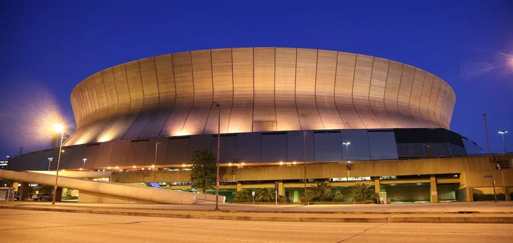
With Super Bowl LVIII barely in the rearview mirror, the NFL was already revealing the logo for Super Bowl LIX, set to take place in the Caesars Superdome, in the vibrant city of New Orleans next month, with Kendrick Lamar as a halftime performer.
New Orleans was initially slated to host last year’s Super Bowl. The league’s decision to expand the regular season from 17 to 18 weeks created a scheduling conflict. The additional week pushed the Super Bowl to a date that overlapped with Mardi Gras, necessitating a change in venue.
This year marks the 11th time New Orleans will host the Super Bowl, tying with Miami for the most appearances by a single city. It will also be the eighth time the Caesars Superdome serves as the venue.
It further solidifies its record as the stadium with the most Super Bowls hosted. New Orleans’ Super Bowl history began with Super Bowl IV in 1970, with its most recent hosting of the event being Super Bowl XLVII in 2013.
However, let’s dig into the Super Bowl LIX logo, its creative inspiration, and how it compares to some of the most memorable logos in the game’s storied history.
The Super Bowl LIX Logo: What Makes It Unique?
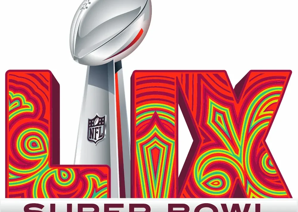
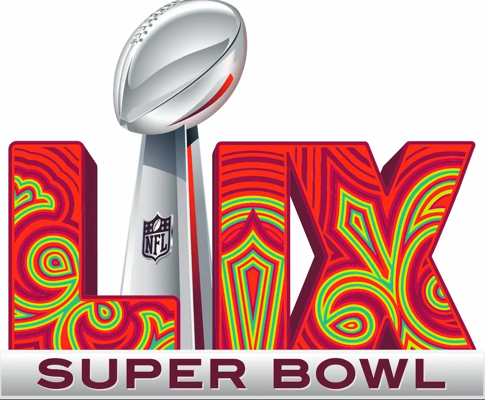
The NFL has continued its trend of incorporating local flair into its recent Super Bowl logo designs. For Super Bowl LIX, the logo draws heavily from the architectural and cultural identity of New Orleans, with design elements inspired by the city’s iconic French Quarter.
Here’s what makes the Super Bowl LIX logo stand out:
- Design Inspiration: The use of wrought-iron patterns mirrors the intricate balconies that define the French Quarter, blending traditional elegance with a modern aesthetic.
- Color Palette: Bright pink and green replace the gradient designs used in previous years, bringing a fresh, playful energy to the logo.
- Legacy Connection: This will be the 11th time New Orleans hosts the Super Bowl, a testament to the city’s enduring significance in NFL history.
This design perfectly encapsulates the vibrancy and character of New Orleans, while staying true to the NFL’s tradition of combining sports and culture.
The Super Bowl LIX logo has arrived and it's beautiful! 😍 pic.twitter.com/48OfiNmt2y
— NFL UK & Ireland (@NFLUKIRE) February 13, 2024
Super Bowl LIX Logo Colors: Can They Predict the Teams According to This Conspiracy Theory?
As the countdown to the NFL’s most anticipated event—Super Bowl LIX—continues, an intriguing conspiracy theory is gaining traction. This theory suggests that the colors of the Super Bowl logo might hold the key to predicting the teams that will clash at the Caesars Superdome, the home of New Orleans Saints, on February 9, 2025.
The Theory Behind the Super Bowl Logo Colors
According to this theory, the colors featured in the Super Bowl 59 logo design are not just aesthetic choices. They could hint at which teams will compete for the Vince Lombardi Trophy. Supporters point to recent examples where the logo colors aligned with the teams that ultimately made it to the big game:
- Super Bowl LVI (2022): Cincinnati Bengals (orange) vs. LA Rams (blue and yellow)
- Super Bowl LVII (2023): Philadelphia Eagles (green) vs. Kansas City Chiefs (red)
- Super Bowl LVIII (2024): Kansas City Chiefs (red) vs. San Francisco 49ers (red and gold)
For Super Bowl LIX, the logo features shades of green, red, and maroon. It led to speculation that teams like the Kansas City Chiefs, Buffalo Bills, Green Bay Packers, or Washington Commanders could be the ones in contention.
And it turns out they were right as the Kansas City Chiefs – red color – and the Philadelphia Eagles – green color – are both represented in the logo.
Teams That Could Fit the Super Bowl LIX Logo Color Theory
As the NFL season approaches the playoffs, several teams align with the logo’s color palette:
- Kansas City Chiefs (red): A perennial Super Bowl contender and AFC West powerhouse led by Patrick Mahomes.
- Buffalo Bills (blue and red): A strong AFC team with high playoff aspirations.
- Green Bay Packers (green and gold): Fighting for a wild card berth as the regular season concludes.
- Washington Commanders (burgundy and gold): A dark horse team that matches the maroon tones in the logo.
Meanwhile, wildcard hopefuls like the Cincinnati Bengals (orange) and Miami Dolphins (aqua green) could still shake up the playoff picture and challenge the theory.
Coincidence or Clever Marketing On The Super Bowl 59 Logo?
While this theory has sparked plenty of debate, it’s worth noting that these connections could just be coincidental—or the NFL’s creative team might have simply chosen colors that resonate broadly with many teams.
Regardless, the idea continues to stir curiosity and excitement as fans wait to see if the Super Bowl 59 logo colors align with reality once again.
Why Super Bowl Logos Matter
Super Bowl logos are more than just promotional assets. They are visual representations of the game’s identity and its connection to the host city. Over the years, these logos have evolved from basic graphics to intricate designs that tell a story, making them a cherished part of the Super Bowl tradition.
A Look Back: The Best Logos in Super Bowl History
While every Super Bowl logo has its own charm, a few have achieved iconic status for their creativity and cultural resonance.
Super Bowl X (1976)
The Roman numeral “X” was simple yet powerful, emphasizing the significance of reaching the 10th Super Bowl.
Super Bowl XX (1986)
With its bold, colorful shapes, this logo embodied the vibrant and futuristic spirit of the 1980s.
Super Bowl XXXVI (2002)
New Orleans took center stage with a logo that celebrated its jazz heritage, featuring design elements reminiscent of musical crescents.
Super Bowl XLVIII (2014)
A modern design that captured the urban energy of New York/New Jersey, incorporating the region’s skyline alongside the Lombardi Trophy.
Super Bowl LIV (2020)
Miami’s tropical identity came to life with a design that included palm trees and ocean-inspired tones, celebrating the city’s unique vibe.
The Evolution of Super Bowl Logos
In recent years, the NFL has leaned toward standardized logo designs that prominently feature the Vince Lombardi Trophy alongside Roman numerals. While this approach brings consistency, it sometimes limits the creativity that made older logos so distinctive.
Super Bowl LIX offers a welcome balance. It follows the current template but still integrates a strong sense of local identity, bridging the gap between tradition and creativity.
Conclusion
The Super Bowl LIX logo is more than just a graphic; it’s a celebration of New Orleans’ cultural and architectural heritage. The NFL’s modern design template blends with the city’s unique charm. The logo sets the stage for what promises to be another unforgettable event.
As we count down to Super Bowl LIX, it’s a great time to reflect on the evolution of these iconic designs and their role in the game’s history. What’s your favorite Super Bowl logo, and how does it compare to this year’s design? Let us know as the excitement builds!
Find out how to bet on moneyline in the Super Bowl LIX here.
